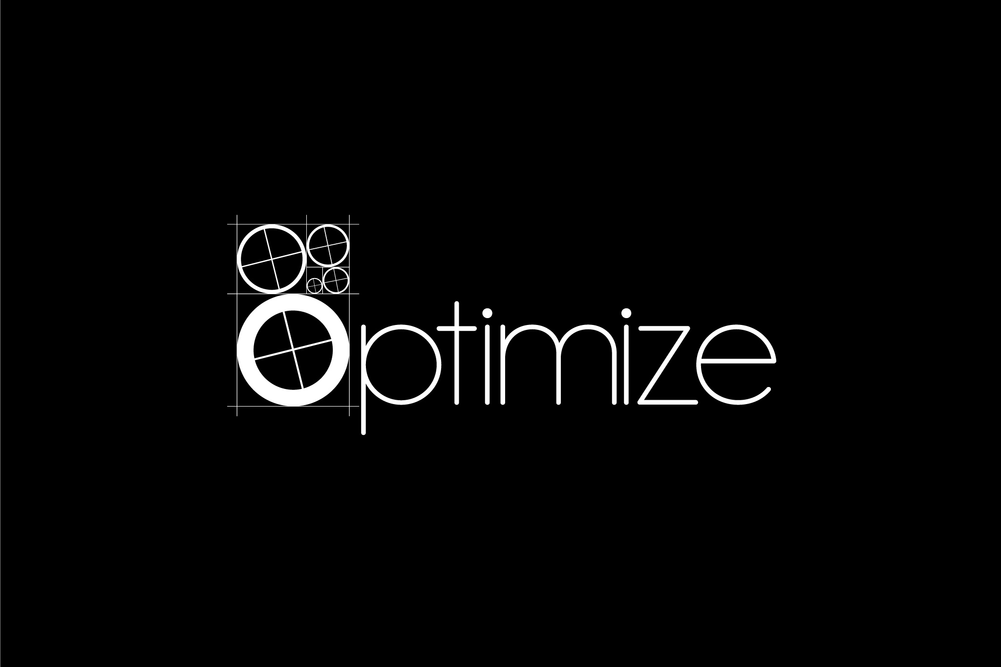
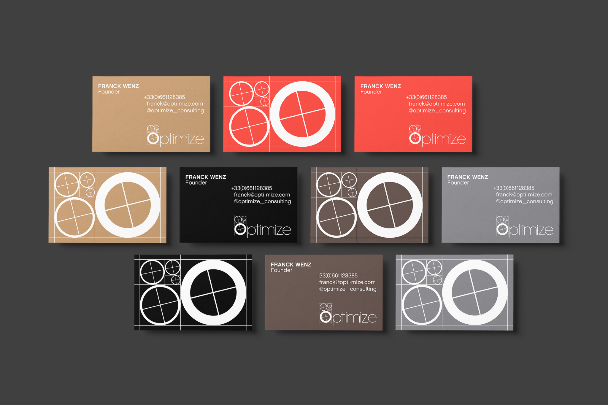
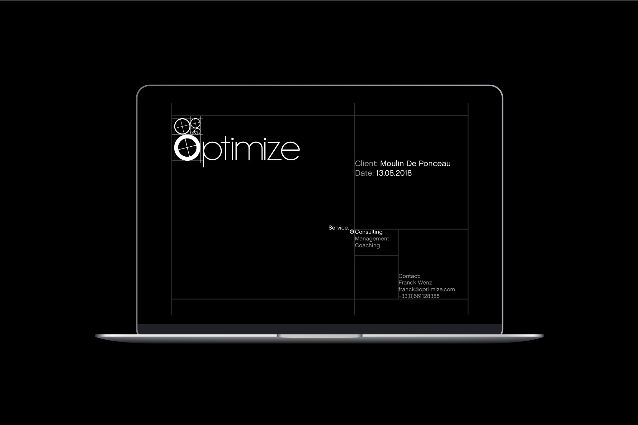
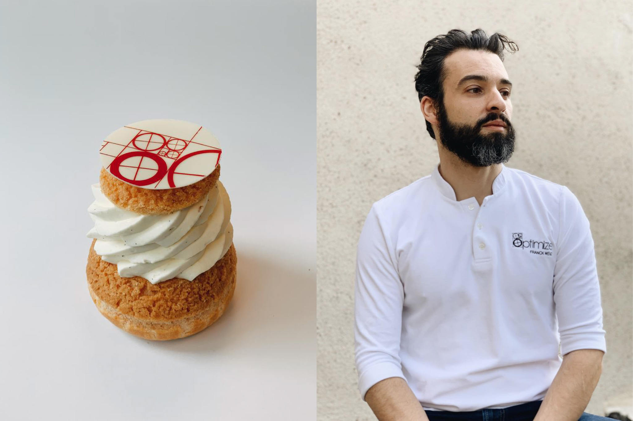
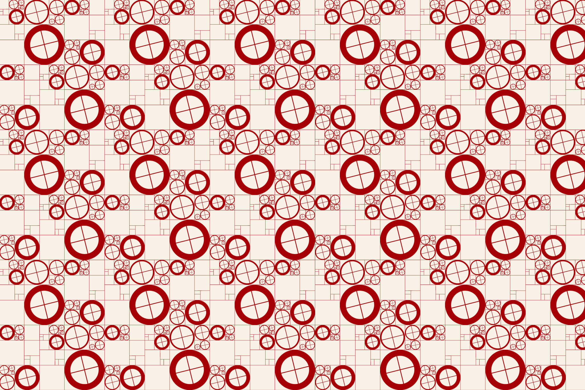
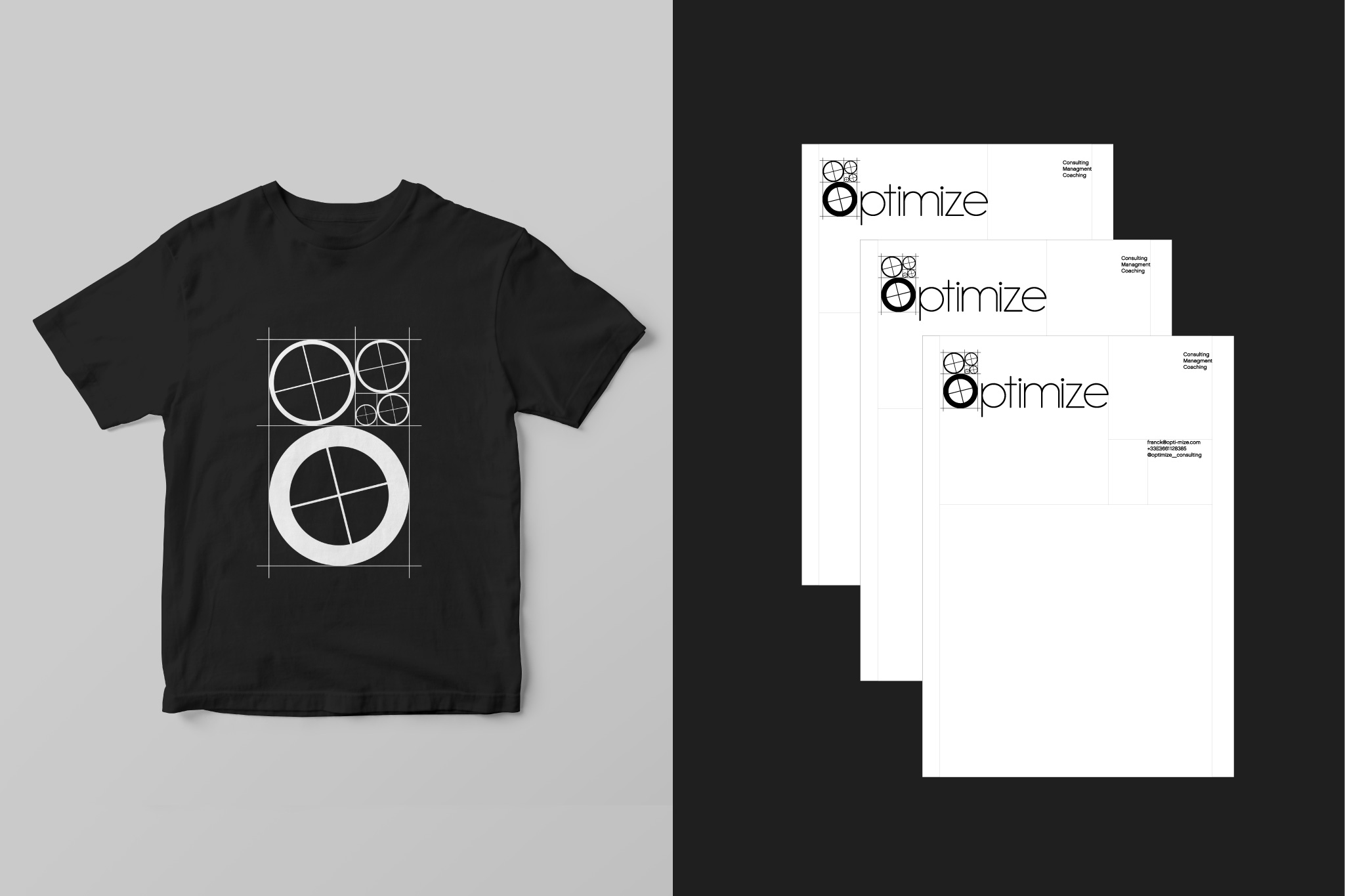
The Identity combines:
The visible structure of the Golden Sequence, used with a fine line base layer that sustains the logo to evoke the harmonic patterns of growth reflected in nature.
Circles (scaled in Fibonacci’s rhythm) rotated and aligned by their internal cross, to symbolize the importance of individual and teamwork focused on the same goal.
Both, structure and circles, united with the letter O of Optimize’s typography creates the visual identity of the brand.
The result of the graphic language mixes: Tradition & Innovation. Structure & Movement. Parts & Wholeness.