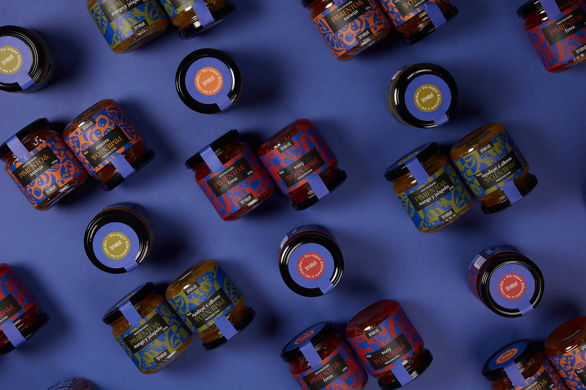
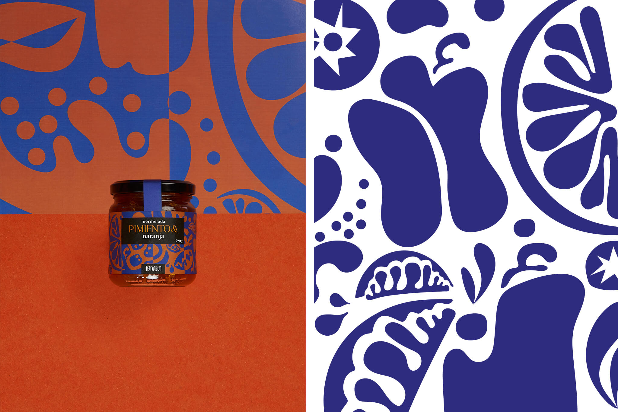
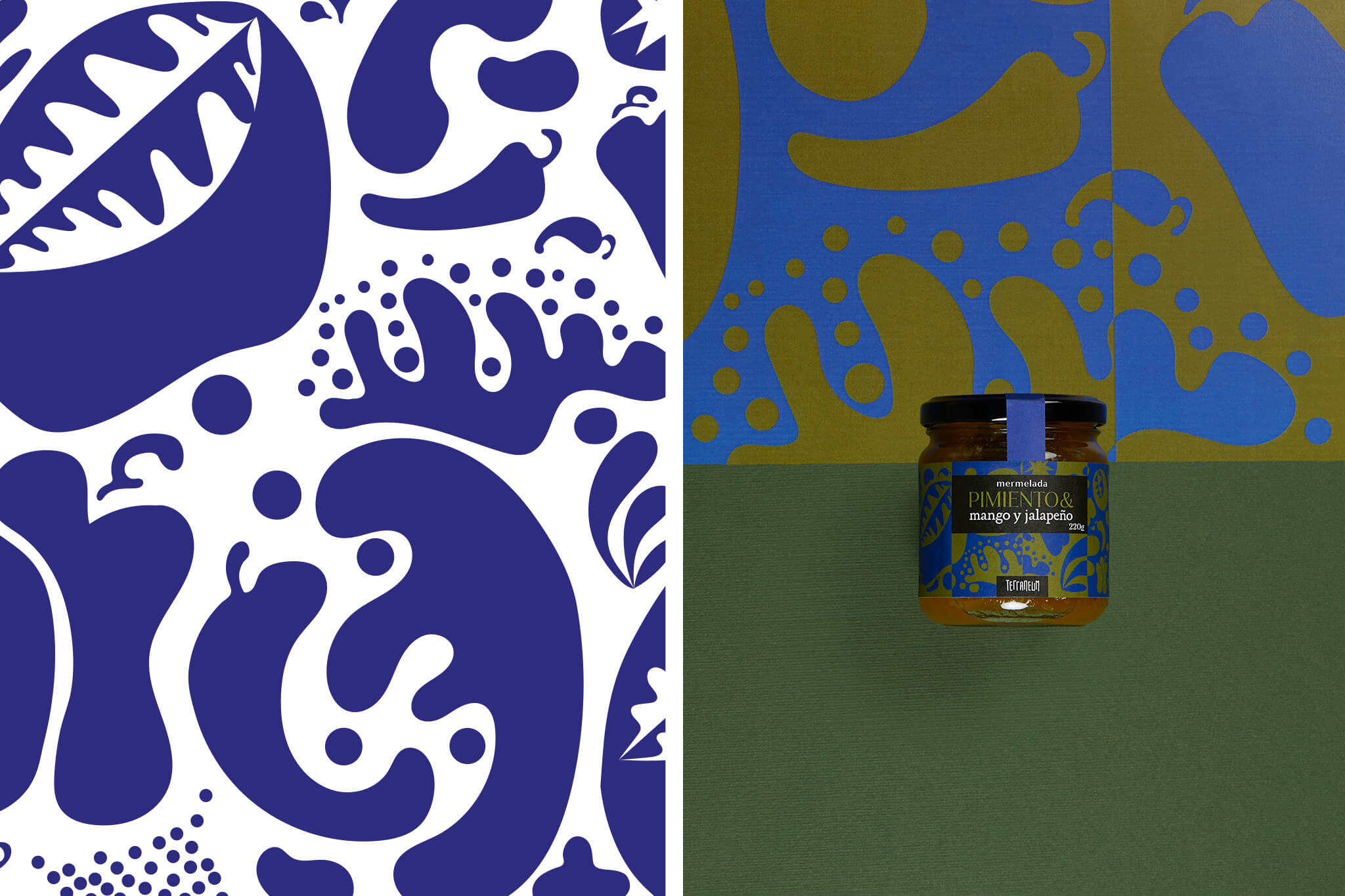
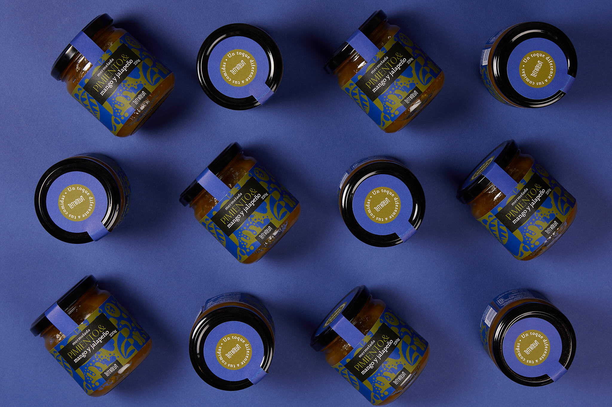
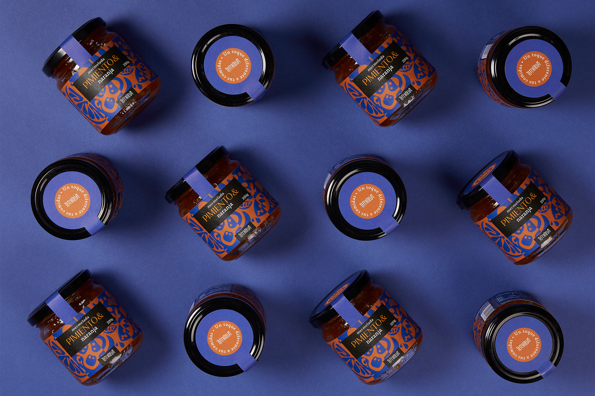
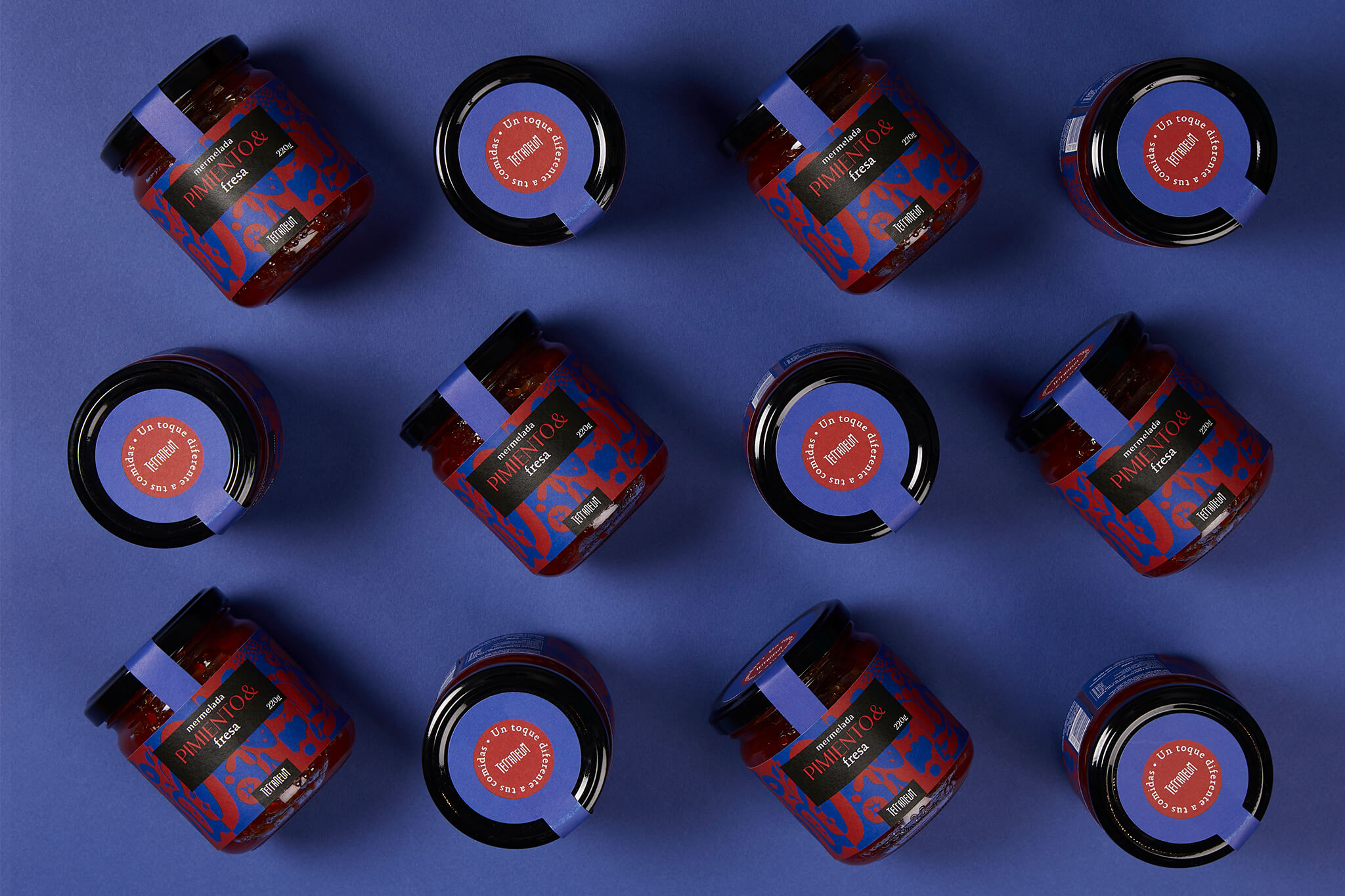
In ÁRBOL we were asked to develop the identity for this new product, the package design for the three flavors and the printing management. This way we assure every single detail was taken care of. That’s the way we like to work.
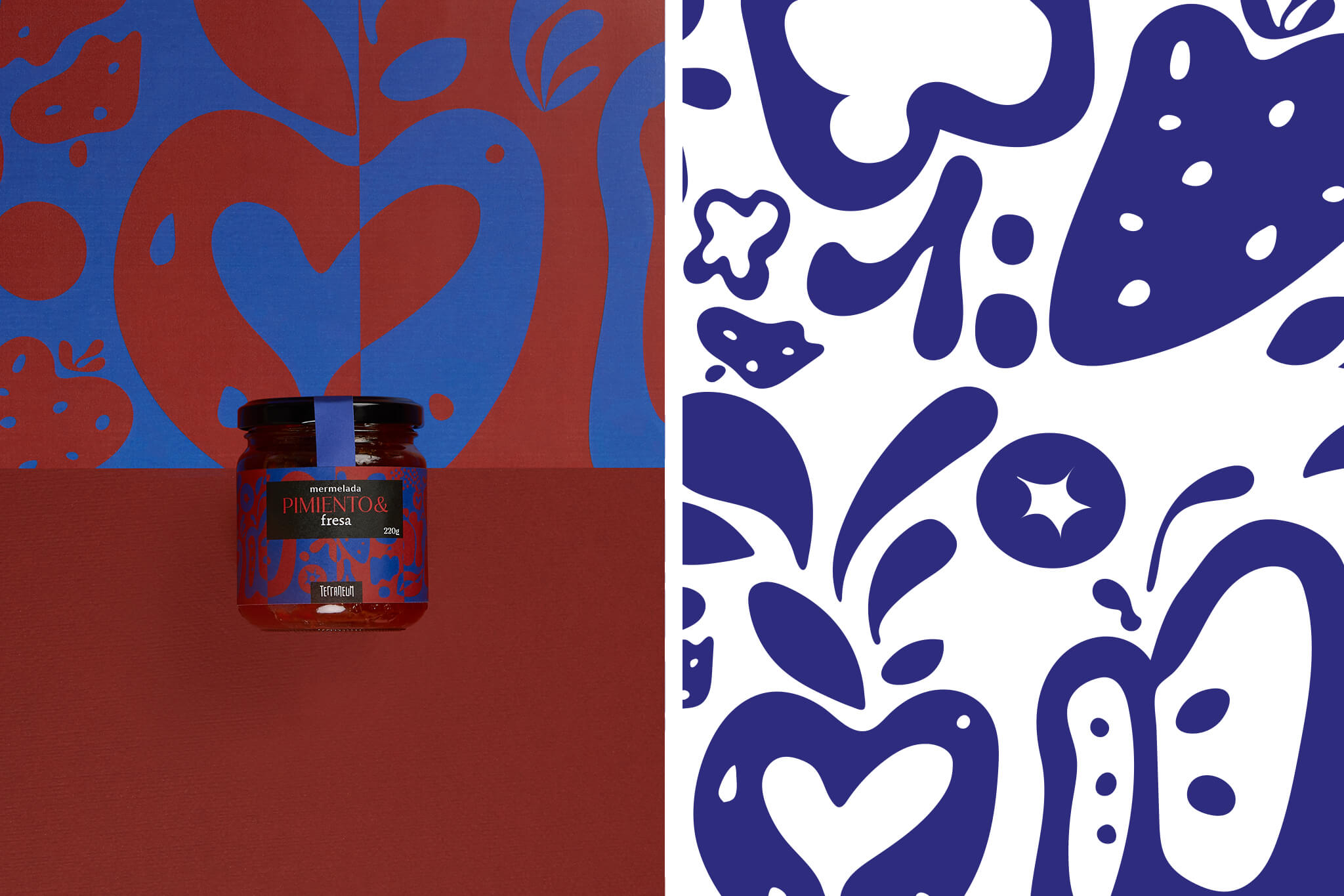
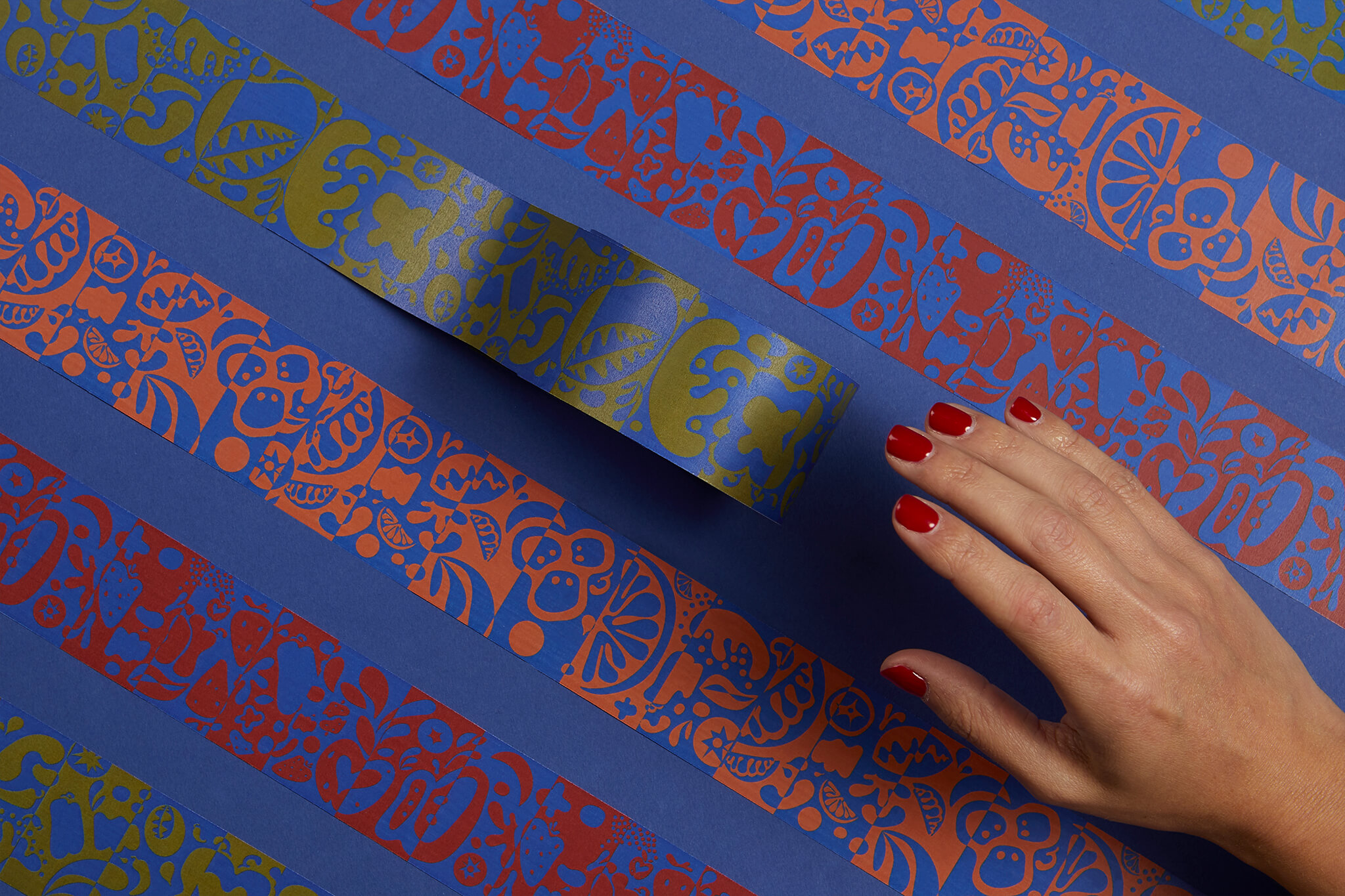
Our purpose was to make the elegant common. We conceived a graphic concept based on a mysterious distinction. The creation of organic illustrations with a graphic treatment, evoques the perfect visual seductive move to ignite curiosity.
We illustrated patterns for each flavor and used a mix of interesting typographies: Jazmín from Latino Type and Absara.