loader image

DOU Pastry Shop

Where good things are shared

Client

DOU Pastelería

Where?

Barrio Gracia, Barcelona.
Spain.

What we did?

Brand Concept
Brand Voice
Brand Identity
Packaging
Motion


Industry

Pastry shop
Gastronomy
Bakery


Share to

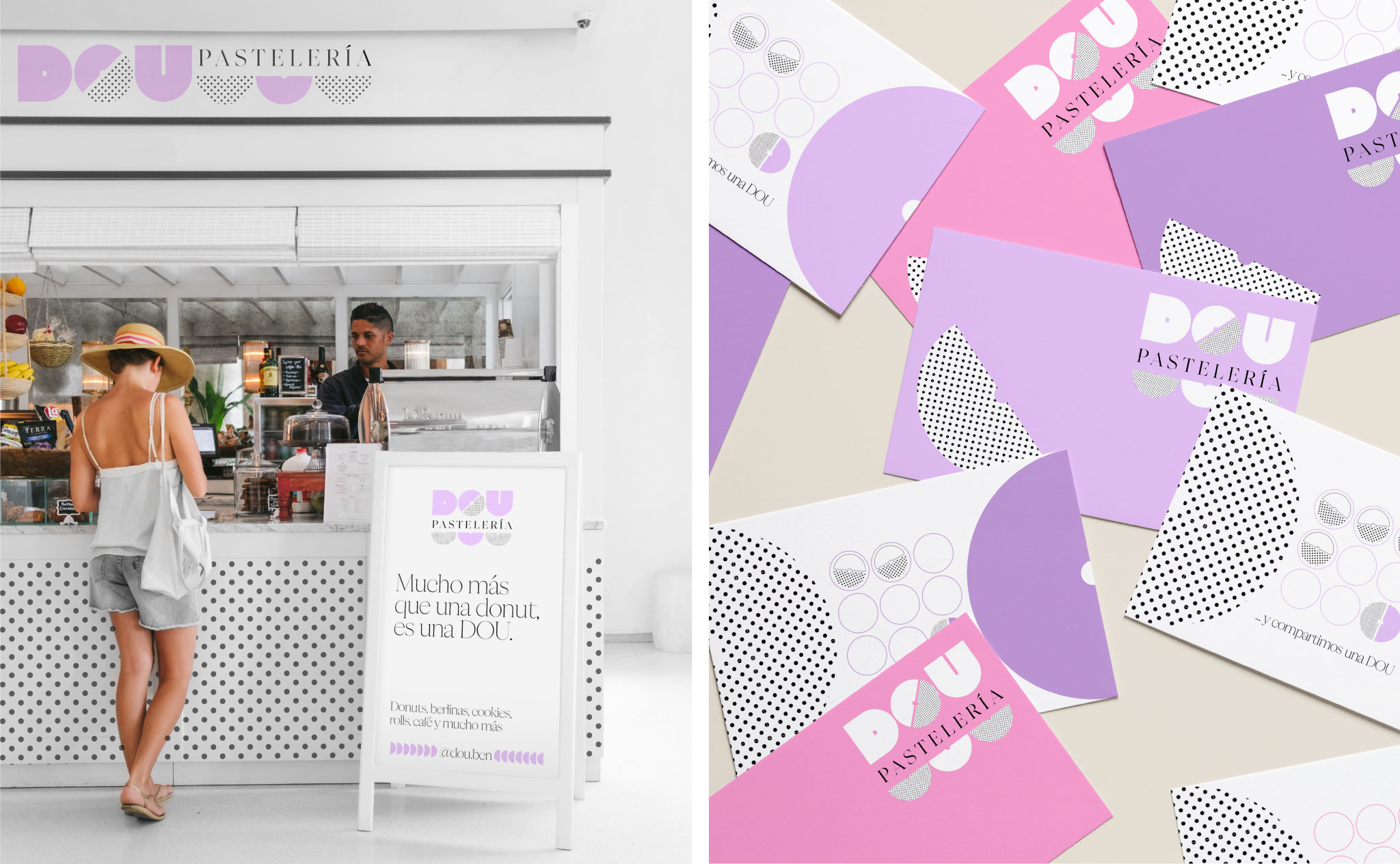
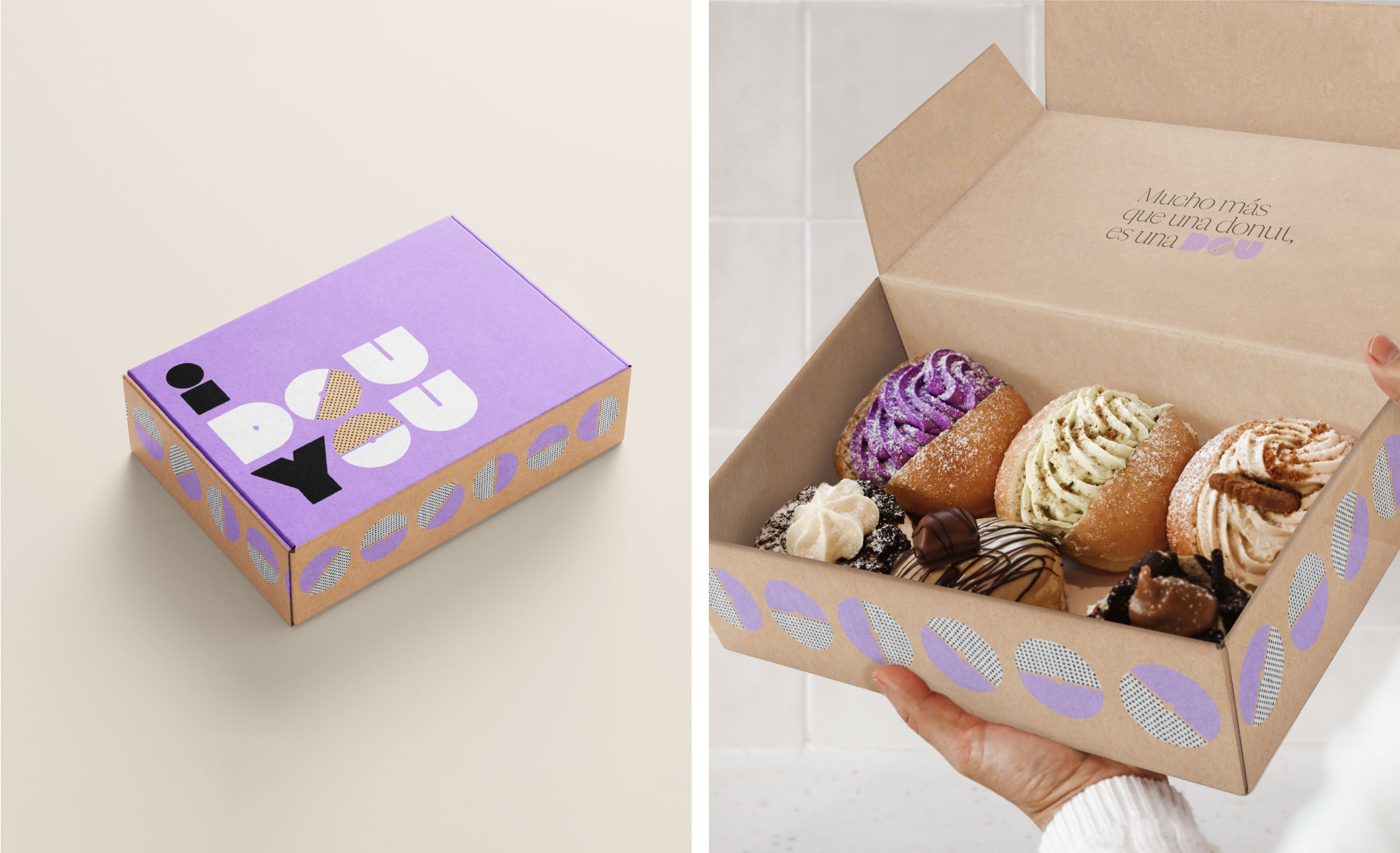
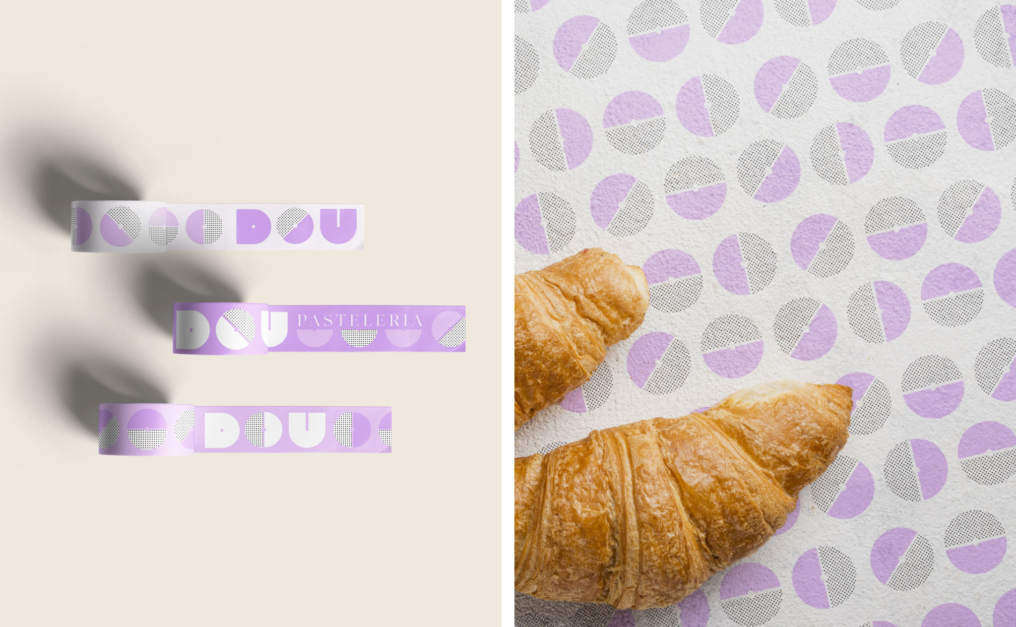
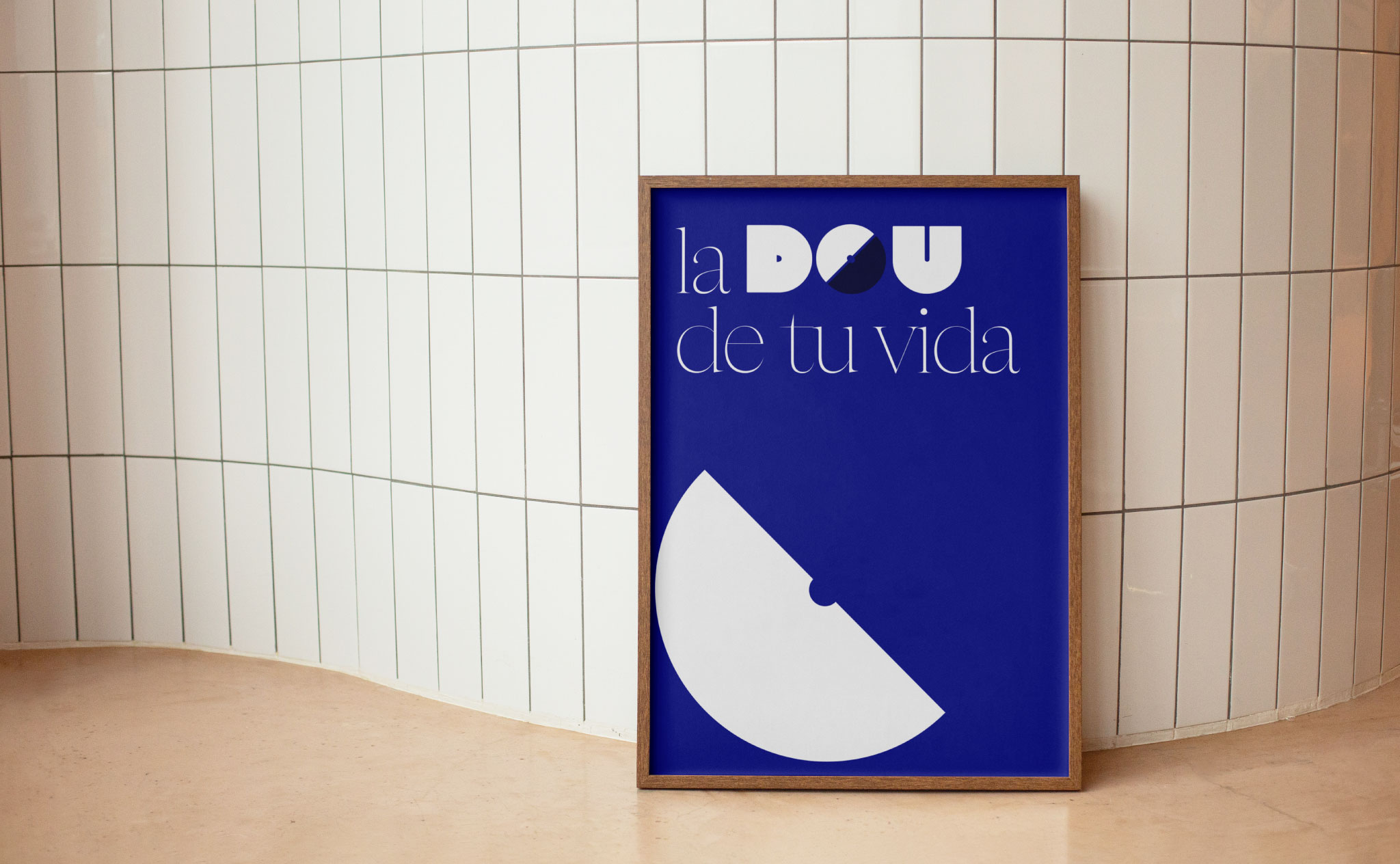
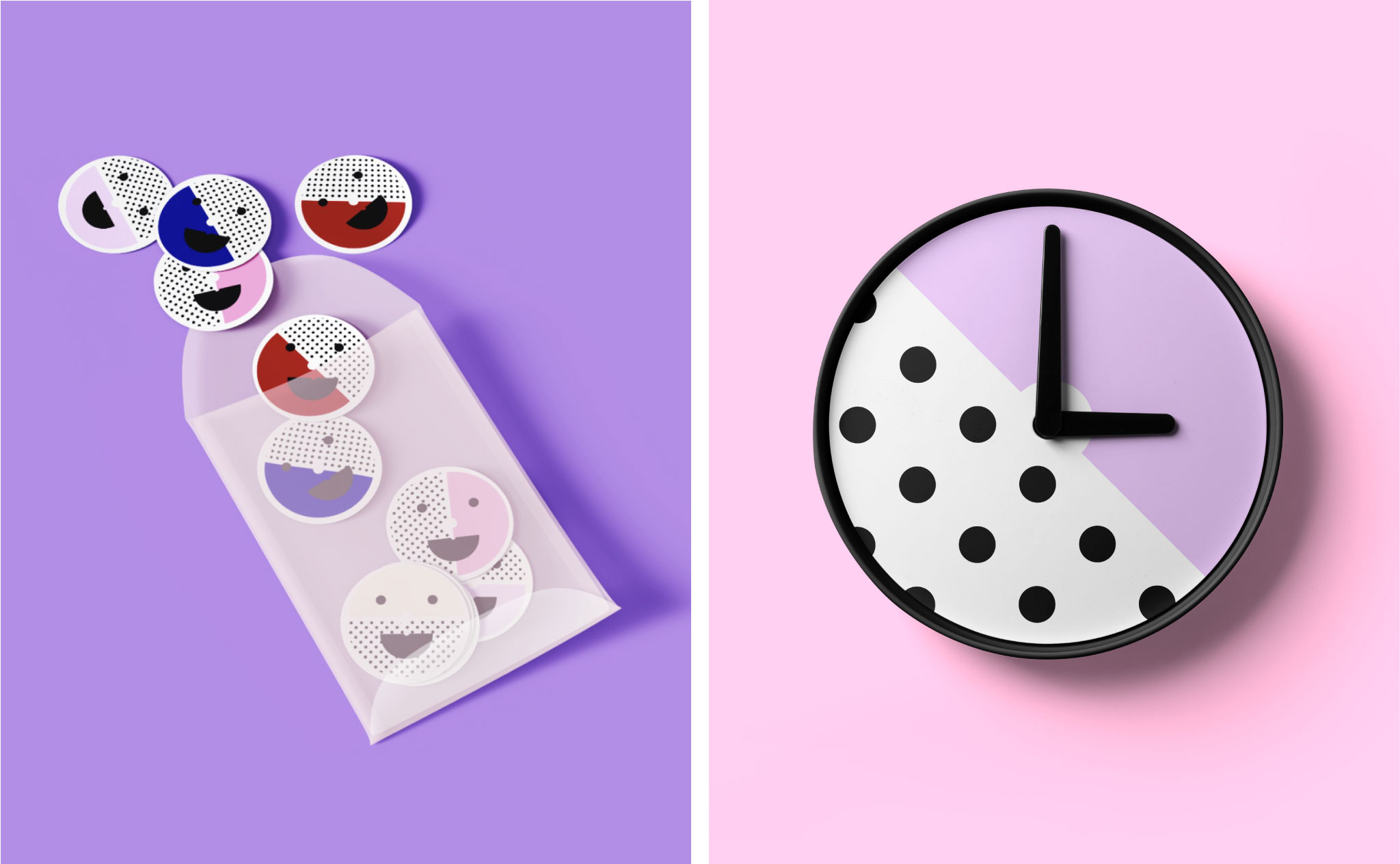
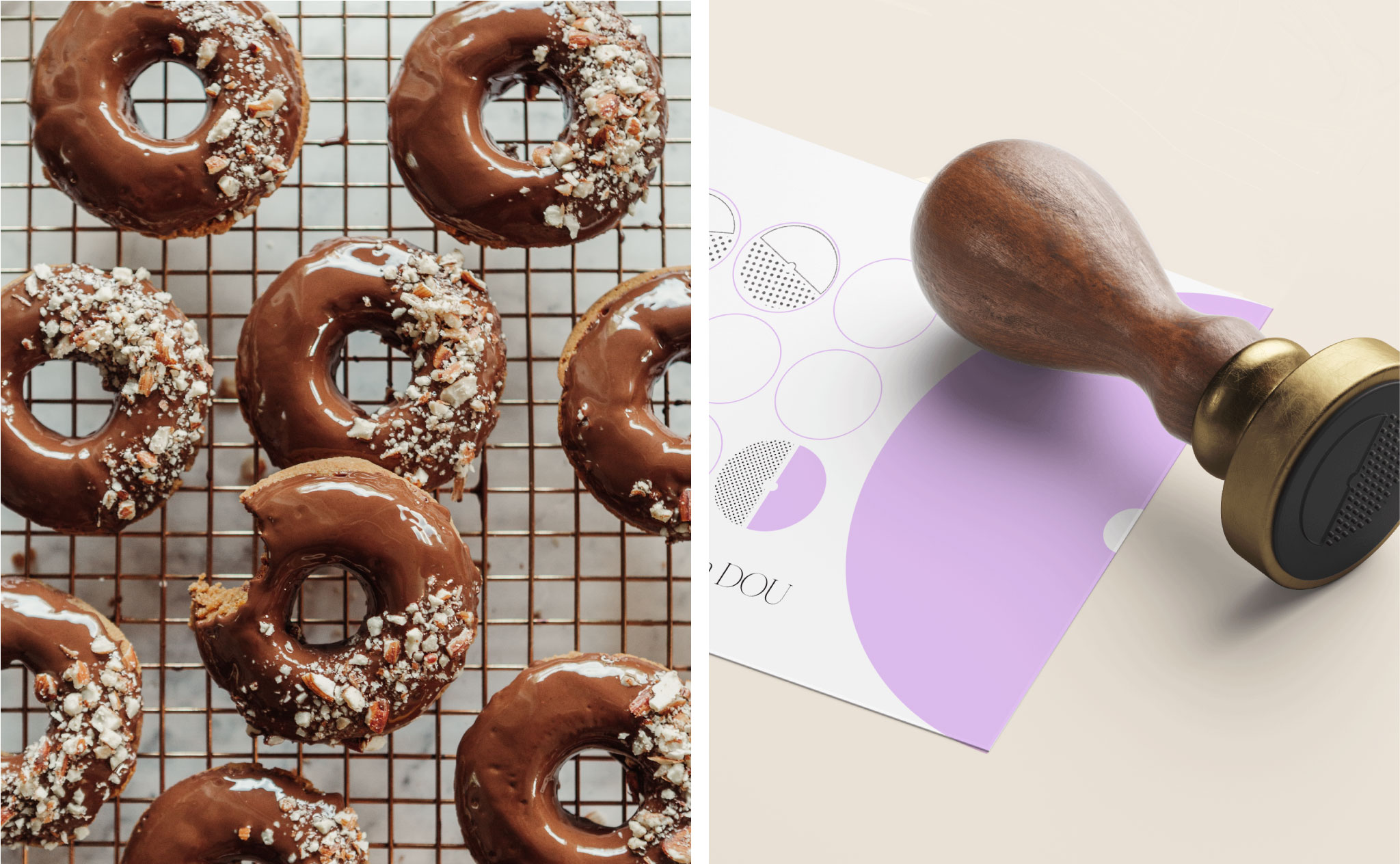
We love color, it is no secret, even more so when it comes to pastry. 

DOU is a pastry shop created for doughnut lovers who also want to enjoy a good coffee. Based in the Barrio Gracia in Barcelona, DOU’s team entrusted ÁRBOL with the Brand Identity of a project with a playful soul.


A concept of a brand that connects with an audience that wishes a joyous life. For people who appreciate the sweet moments of life and enjoys sharing them with their special ones.


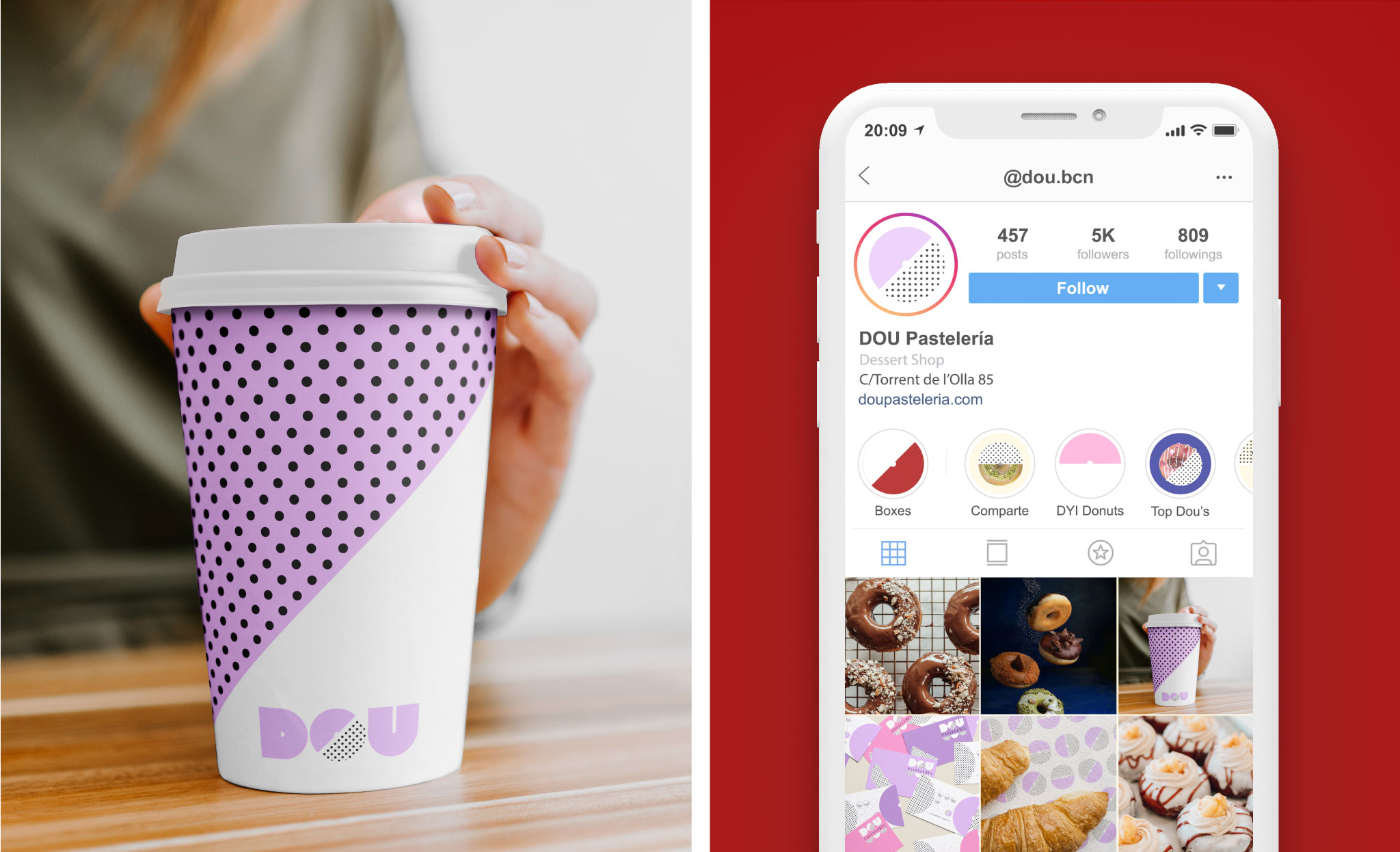
ÁRBOL developed the Brand Identity, which would then be shared in different media: print, digital, applications that elevate the consumer experience.

It was clear that the result had to be simple but at the same time playful & cheerful.

Brand Concept

Since we were kids we have known the power of sharing joy. Our starting point for the concept was: “all good is meant to be shared” and with this, the happiness and pleasure of enjoying a good dessert.

We played with the letter “O” as a symbol of the doughnut. A friendly “O” used on the identity as a symbol to connect us with fun.

ONE DOU THREE

Clear and simple. The letter “O” is divided into two as a literal representation of the verb “to share”. Two halves of a doughnut full of color and textures that invite us to smile.

Coloring DOU

A subtle sugar high palette. Composed of cream colors contrasted with solid and elegant tones such as blue and dark red. This contrast represents the essence of the brand that offers a high quality doughnut and with the best market ingredients; combined with the simplicity and capacity that a doughnut has to connect with children and adults.

Sophisticated “candy” tones. A doughnut that you definitely want to share (or not :P)

I DOU YOU

Because the voice of the brand is an important pillar of the identity, we created messages as part of integral brand design for the application on packaging, local and social networks.

A doughnut from DOU’s pastry shop is all you need to express love. You only need a doughnut and a: “I DOU YOU” box to express love. In addition, since the brand is in Spain, we also proposed “UNO DOU TRES”, a specific message for the varied box of three donuts. “JUST DOU IT” as an on-brand call to action.

We love open mind customers who believe their brand comes to step into the market with authenticity. DOU is one of those, open to creativity and good design. As a team, we had total freedom to propose ideas. We had a blast designing this sweet and delicious brand identity.